
This article is written by Khushali Sandhi. Khushali is a Senior User Experience Designer at Amazon with over 13 years of professional experience, specializing in creating impactful UX/UI solutions for complex cloud-based database systems. After beginning her career in front-end development in India, her passion for understanding and solving customer problems led her to transition into UX/UI design, culminating in her current role at AWS.
It can be tedious to view data/statistics in the form of plain graphs, tables, or pie charts. However, to represent data in a scannable and logical manner, we often rely on these forms of representation, especially in environments where customers need to examine the data daily to track their audience's status. So, how can we enhance user experience in these contexts? Drawing from my experience and online UX trends, I want to share tips for improving the UI for potentially better UX.
Let's start with questions to understand the emotions customers experience when interacting with data:
Who is looking at the data?
We start with understanding who is looking at this data. Even though the app/website may have been designed for the doctors or managers or administrators the data presented may be looked at by someone else in the org. It may be nurses or assistants or HR or someone else. Find out who is actually gathering the data for our users.
How many times in a day/week/month do users look at the data?
If it is daily or weekly and the data is represented in a plain format, users probably just look at it to get away with their daily tasks. They are not really excited while interacting with the UI. The UI may be usable, but there is an opportunity to redesign it before they get frustrated and switch to another product.
What kind of data are users looking at, and what are they going to do with it?
The kind of data they are looking at is the most important factor in deciding the kind of emotions that are invoked. Is it the data of patients or employees, daily weather, or something else?
Try to understand what they're going to do with this data. Is the data going to tell, for example, how many patients have their appointments booked successfully or how many employees participated in the last marathon event? Whatever it may be, the ultimate information gathered from the data helps in designing a user experience to bring the aspect of emotion.
Assuming we have the answers to these questions, it's time for us to start thinking about the UI improvements we can make. Here are a few things we can do (this list is not exhaustive in any way. There are more things we can do, but I wanted to share the ones that influenced my design thinking):
1. Creating a scanning pattern map to embed animations
From the questions above, we know what data users are looking at and what they are going to do with it. Let's say there is a tabular data. Create circles around the numbers and connect those in the scanning direction using lines. Something like this:
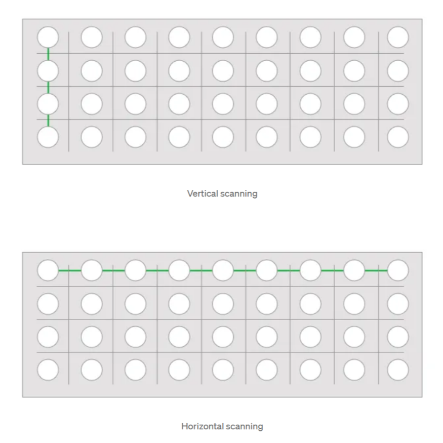
This kind of map helps with creating visuals that make easy scanning. For example, if the purpose of the data presented is to compare the data in two columns, break the vertical columns. Rearrange the numbers for easy comparison.
These patterns also help in adding life to the data. While the table is being loaded, animation could be used to popup the numbers in the direction of scanning lines.
In the above animation from Dribble by Lukáš Straňák, I love how it pops up the numbers (increasing or decreasing values) and shows blank lines in the direction of the scan while loading.
Animations are fun and helpful in increasing engagement but don't overdo it. A proper balance between static data and animated content should be maintained.
2. Use messages with humor/bring motivation/bring empathy
The goal of these messages is to:
- Summarize the data results in a user-friendly, exciting manner without having to look at the data first.
- Keep up the excitement within users so that they come back often. Bring positivity even if the numbers go down. For example, if the data is about some kind of progress and it went down; the messaging should be encouraging to do more.
- It is also a way to bring empathy in users towards their users. For example, if the data is about employees who could/couldn't participate in an event, the messaging should be such that it doesn't bring frustration toward those employees who couldn't attend it.
The type of emotions invoked would help in drafting appropriate messaging for our customers.
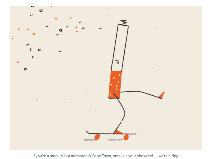
The above animation with a message from dribble by MUTI seems to be a perfect example of it. Instead of just saying, "we're hiring" it uses a language that is encouraging. It keeps a perfect balance of purpose and humor.
3. Use images, if necessary, on graphs to show the purpose well
This becomes a little tricky as there could be multiple interpretations when images are used in graphs. Be careful while using them. For example, using pizzas to display a pie chart may make more sense to use in a pizza restaurant dashboard. Figure out the relevant images that could be used during user testing sessions.
I love this visualization chart on dribble by Anton Egorov.
Wrapping It Up
Data-heavy apps/websites are complex and number-heavy. However, there are ways to work on the UI to improve the overall user experience. In my view, animations, proper messaging, and relevant images have a lot of potential to bring life to the data.
References:
- Interaction Design Foundation - IxDF. (2016, June 3). What is Emotional Design (ED)?. Interaction Design Foundation - IxDF. https://www.interaction-design.org/literature/topics/emotional-design
- Komninos, A. (2020, July 17). Norman's Three Levels of Design. Interaction Design Foundation - IxDF. https://www.interaction-design.org/literature/article/norman-s-three-levels-of-design
- Walter, A. (2011). Designing for emotion. A Book Apart.
- Norman, D. A. (2004). Emotional design : why we love (or hate) everyday things. Basic Books.
- Nan Jiang, Xinyu Feng, Hui Liu and Juan Liu, "Emotional design of web page," 2008 9th International Conference on Computer-Aided Industrial Design and Conceptual Design, Kunming, 2008, pp. 91–95, doi: 10.1109/CAIDCD.2008.4730526.
- K. Füller, M. Böhm and H. Krcmar, "Designing for Positive User Experience in Product Design: A Qualitative Analysis of Toolkit Design Elements and Their Implications on Emotional Reactions and Perceptions," 2016 49th Hawaii International Conference on System Sciences (HICSS), Koloa, HI, USA, 2016, pp. 1810–1819, doi: 10.1109/HICSS.2016.230.
© 2026 ScienceTimes.com All rights reserved. Do not reproduce without permission. The window to the world of Science Times.


