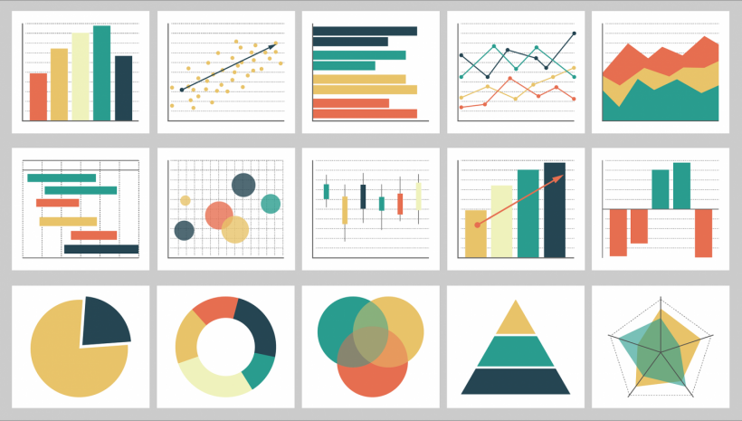
It's crucial to incorporate a variety of content kinds when developing a social media strategy.
It might be anything from product images and behind-the-scenes videos to links to your blog postings. But social media infographics are compelling content you can utilize to increase traffic and interaction. It is a visual way to communicate complex information.
Making content with data represented visually is a terrific approach to connecting with your audience.
Designing a social media infographic may differ slightly from creating one for your website, blog, or email newsletter.
You'll learn more about making infographics specifically for social media, sharing them on each network, and boosting followers and interaction with the help of these suggestions.
Keep it simple.
They can be highly shareable and engaging, making them a valuable tool for promoting your brand on social media. In general, the best infographics are simple and easy to understand. They should use clear visuals and concise text to explain a concept or tell a story. And while infographics can be highly detailed, remember that less is often more. Too much information can overwhelm viewers and make your infographic less effective. Keeping it simple can help ensure that your infographic successfully communicates its message.
Use a neutral background.
One of your first decisions is what background color to use. While some designers prefer bright and bold colors, a neutral background can be an excellent choice for an infographic.
A neutral background makes your content stand out and be the focus of attention. When choosing a color, consider your infographic's overall tone and feel. It creates a sense of calm and order, making it ideal for infographics that convey data or complex information. If you're unsure what color to use, why not try a classic black or white?
Use easy-to-read fonts.
When creating an infographic for social media, choosing a font that is easy to read is essential. You want people to be able to scan your infographic and understand the key points quickly.
Sans serif fonts are generally a good choice for infographics because they are straightforward. Some famous sans serif fonts include Arial, Helvetica, and Verdana.
If you want to add a little personality to your infographic, you can try using a script font. Keep the text legible using a simple font like brushed scripts instead of more elaborate calligraphic fonts.
Stick to a single message.
Infographic making can be a great way to convey your message.
However, sticking to a single message when designing your infographic is essential. Trying to cram too much information into one graphic can make it confusing and difficult to read. Instead, focus on making your infographic clear and concise. Choose one essential point you want to communicate, and then use simple visuals and easy-to-understand language to get your point across.

Use icons and graphics sparingly.
Icons and graphics are great ways to add visual interest to an infographic but use them sparingly. Too many icons and graphics can make an infographic seem busy and cluttered, making it difficult for viewers to glean the most important information. Instead, focus on using a few well-chosen icons and graphics that compliment the overall design.
Make sure all information is accurate.
It's essential to ensure that all of the information in your infographic is accurate. It means checking your sources, double-checking your calculations, and fact-checking any claims you make.
Inaccurate information can quickly undermine the credibility of your infographic, so it's essential to take the time to get it right. Fortunately, several online tools can help you verify the accuracy of your data.
Choose a color scheme that pops.
It's essential to choose a color scheme that grabs and holds attention. While your first instinct might be to go for bright, neon colors, these can be overwhelming and difficult to read. Instead, try to choose a few colors that complement each other and create high contrast.
For example, a black background with bright white text is always easy to read. You can also experiment with shades of the same color to add depth and interest.

Use charts and graphs for data-heavy infographics.
It's important to remember that less is more. Too much text can be overwhelming, so use an infographic graph and chart to break up the information and make it easier to digest. When selecting data to include, focus on the most critical points and choose visuals to help illustrate your data. For example, a line graph would be a good choice if you're trying to show how two things are related. And if you're trying to compare several items, a bar chart would be a better option.
Pay attention to size and proportions.
Paying attention to size and proportions when creating an infographic is essential. The image should be large enough to be easily seen but not so large that it takes up too much space on the screen. In addition, the image's width should be proportional to the amount of text included. Too much text will make the infographic challenging to read, while too little text will make it difficult to understand. You can create an informative and visually appealing infographic by considering these factors.
Online infographic creators have templates that come in different sizes depending on the social media channel. In addition, they also have organizational chart examples, email newsletter designs, and other layouts you'll need.
Proofread
Before you post an infographic, it is crucial to proofread it carefully. Check for spelling and grammatical errors, and make sure that the information is accurate. You should also double-check any links to external sources.
Conclusion
Creating social media graphics can help increase brand awareness and traffic to your site and help in your campaign. To use this strategy, visit Venngage and try some available templates. Sign up today to access all of them.
* This is a contributed article and this content does not necessarily represent the views of sciencetimes.com


!['Cosmic Glitch' in Einstein's Theory of General Relativity Could Be Explained in This New Scientific Tweak [Study]](https://1721181113.rsc.cdn77.org/data/thumbs/full/53435/258/146/50/40/cosmic-glitch-in-einsteins-theory-of-general-relativity-could-be-explained-in-this-new-scientific-tweak-study.jpeg)


