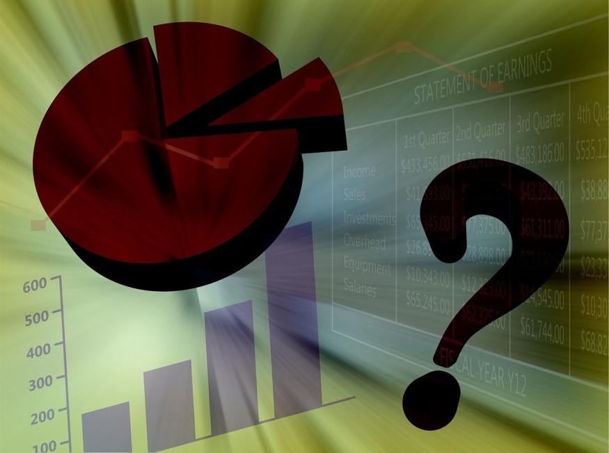
Pie charts are frequently employed as visual summaries to aid the general public in comprehending big data and numbers, reflecting people's data-driven lives. However, pie charts are not the best way to use as a visualization diagram and are even discouraged in reports and presentations.
Pie Charts Explained
A pie chart is a visual representation of data using a circular diagram, where slices indicate the relative size of each category. The "pie" represents the whole dataset, and its "slices" depict the individual parts.
To construct a pie chart, categorical and numerical variables are required. Each segment and sector in the pie chart signifies a specific percentage of the total, and the sum of all segments equals 360°. The pie chart is a valuable tool for data representation, offering a clear visual overview of the distribution of different categories.
The formula for calculating the degrees in a pie chart is (Given Data/Total value of Data) × 360°. It is not obligatory to convert the data into percentages unless specified; direct calculation of degrees for the given data values allows for the accurate depiction of the pie chart.
The steps involved include categorizing the data, calculating the total, dividing the categories, converting them into percentages, and finally, determining the degrees. This process ensures an accurate and visually informative representation of the data distribution in the pie chart.
The Pitfalls of Pie Charts
Pie charts pose challenges when there are more than two categories, introducing potential misrepresentations of percentages that hinder readability.
The circular format of pie charts creates difficulties in determining the largest area, exemplified in three instances with five similar categories each. The inherent circularity lacks a common reference point, complicating the interpretation of different segments.
The drawbacks persist when pie charts involve numerous categories, as evident in a chart displaying hundreds of categories related to COVID-19 data sources. The absence of clear labels, coupled with the prevalence of tiny slices and a diverse color palette, amplifies the complexity and renders interpretation challenging for all viewers.
This issue becomes even more pronounced for individuals with color blindness, particularly those with deuteranomaly, affecting approximately 4.6% of the population. A simulation illustrates the struggles such individuals face in deciphering the information presented in a typical pie chart.
Furthermore, three-dimensional renditions of pie charts exacerbate problems, leading to significant distortions in data representation. An example highlights equal-sized yellow, red, and green areas (one-third each), yet their perceived differences arise from angles and the positioning of the bottom slice in the pie chart.
This emphasizes the limitations and potential misinterpretations associated with the use of three-dimensional pie charts in conveying accurate data insights.
Alternative to Pie Charts
Designers and statisticians often criticize pie charts because they are generally inappropriate for data visualization despite their ease of production. While their friendly appearance and simplicity contribute to their popularity, opting for alternatives like horizontal bar graphs is usually recommended for more effective communication of information.
If you must use pie charts, limit them to showing percentage breakdowns with slices representing specific percentages out of 100%. Ensure the slices are ordered by size for better readability. Avoid using pie charts with more than 5 slices and never opt for a 3D format.
Before inserting a pie chart into a report or presentation, try using a bar graph first. Compare the two and choose the one that is easier to read and understand. In the product sales breakdown example, it quickly shows that Product D sold more than Product C, and Product A is in 3rd place.
RELATED ARTICLE:
Check out more news and information on Math in Science Times.
© 2026 ScienceTimes.com All rights reserved. Do not reproduce without permission. The window to the world of Science Times.


